Bulletproof Radio Buttons
#Overview
This June I designed a radio button and when it was developed it looked about 90% correct. When it was tested across browsers it just didn’t hold up. This felt like a project that I could tackle to learn more about CSS and help out our Front-End Developer a little by taking something off his plate.
#Goals
- Develop with CSS only
- Keep it accessible
- Make it look 100% like the designs
- Work across browsers
- Flexable Width
#Quick Search
First thing I did was search around a little and came across this post by Roger Johansson. Really Roger solved the problem so I knew I didn’t have to look any further. All I had to do was use his code, but when looking into the demo I realized he was using images for the radio’s different states. It being 2017 I figured it would be nice to update the code by removing the images and just use css only.
#The Solution
Here is the original radio button’s design. As you can see it’s pretty straight forward. I’d like to break down Roger’s solution into 5 parts.
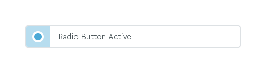
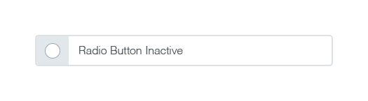
Part 1: HTML. Wrap both the input and label element in a div. This creates the appearance that both elements are one and allows for some next sibling CSS magic. It’s important to note that in this example we shouldn’t wrap the input within the label although both methods are accepted by the W3C. We will talk more about why the HTML structure is important in Part 5.
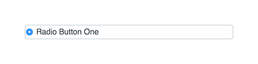
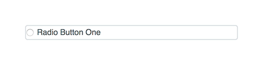
Part 2: Expand Label. Next we will give the label a width of 100%. This means everything that we position over the label will have the appearance of being clickable even though it may not really be. This step releases some cross-browser pressure when it comes to styling of inputs.
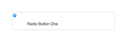
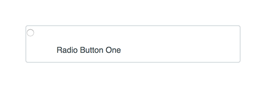
Part 3: Align Input. Now position the native radio button overtop of the label. I don't hide the input in case a browser doesn’t support the ::before and ::after elements. This will allow our solution to elegantly breakdown with older browsers.
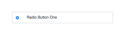
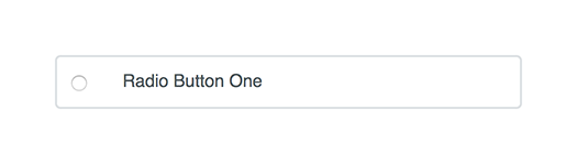
Part 4: Align Pseudo Elements. Next we will add the pseudo radio button and it’s gray background over top of the native radio button and label with the ::before and ::after elements.
Part 5: Creates States. Finally we will add a hover state and checked state. Earlier in Part 1 we mentioned that it was important to have the input and the label relate as siblings. Since CSS has the :selected class with inputs we know when the input is active or not. This allows us create two states for the label by piggy backing off the input’s :selected state. We do this with the sibling selector by combining the :selected state with “+ label”. Magic! If we had wrapped the input inside the label we wouldn’t be able to change the label’s appearance because there is no way to select a parent element with just CSS only.
Check out the demo here and a big thank you to Roger Johansson for sharing his solution all those years ago.
Testing
The radio buttons have been tested on the following devices: